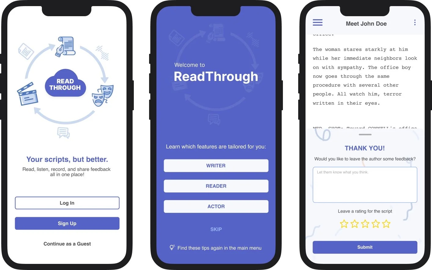
ReadThrough
A redesign of a script-sharing web app, informed by usability testing to help new users navigate the desktop and mobile interfaces.
ROLE
Mobile Designer, working alongside a desktop designer and two researchers
SERVICES
UX research, mobile design, prototyping
TIMELINE
3 weeks, May 2022, client project through General Assembly’s UX Design Immersive
TOOLS
Figma
The Brief
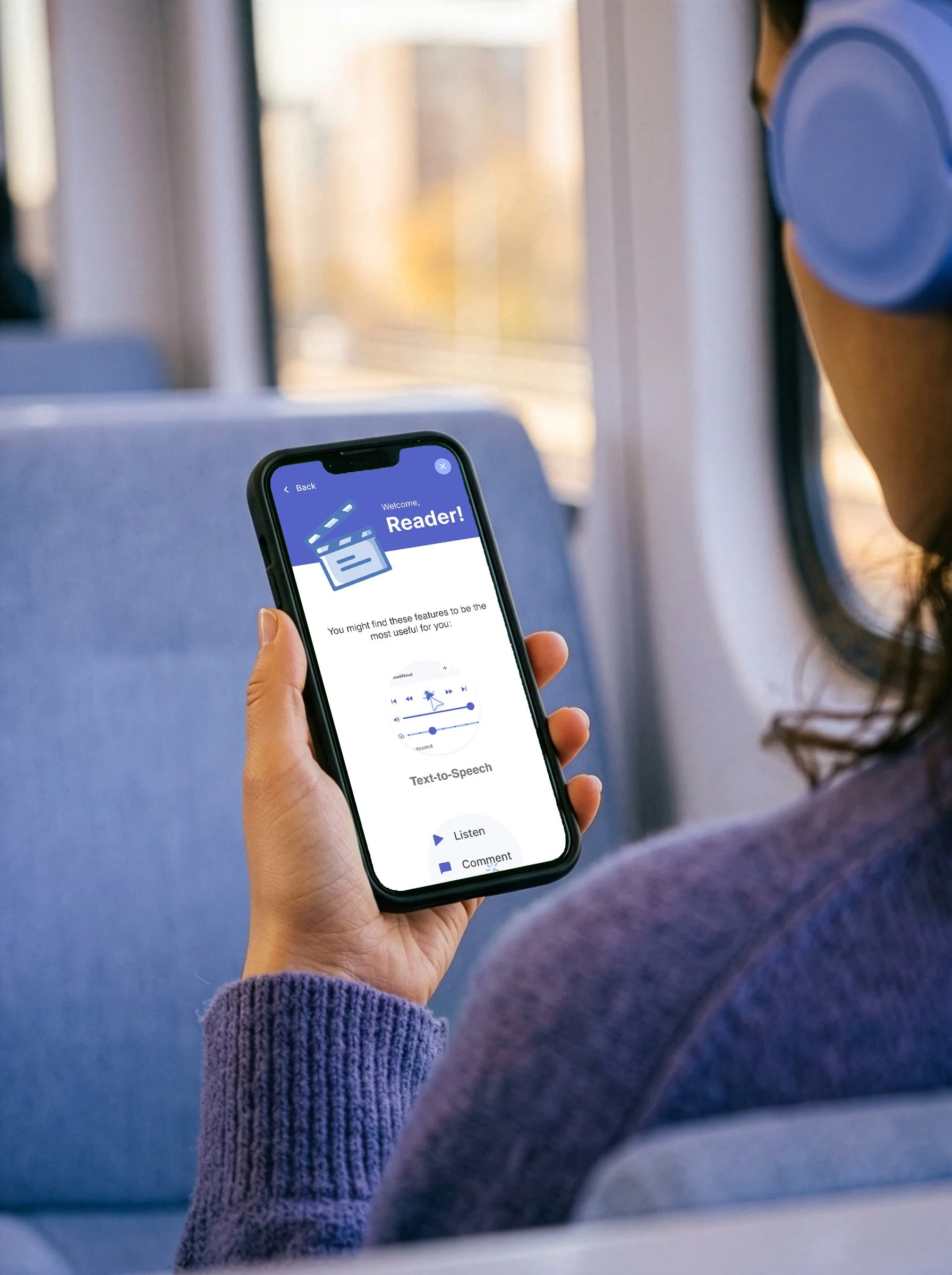
ReadThrough is a web app that lets scriptwriters share their work, readers give feedback, and actors rehearse their lines. Its founder, a scriptwriter, built it so he could listen to scripts on long commutes. People signed up but didn't stick around: the app’s features were hard to find, and new users landed on an empty dashboard with nowhere to go, driving a 70% bounce rate. Our team took ReadThrough on as a real client project during General Assembly’s UX Design Immersive, aiming to make the app easier to learn and more engaging without major structural changes, since development time was limited and the founder planned to expand.
The Approach
We started by watching people use the app. In 14 usability tests on the desktop site and 6 interviews, new users struggled to record, share, and comment, while longtime users lost track of their files in a cluttered dashboard.
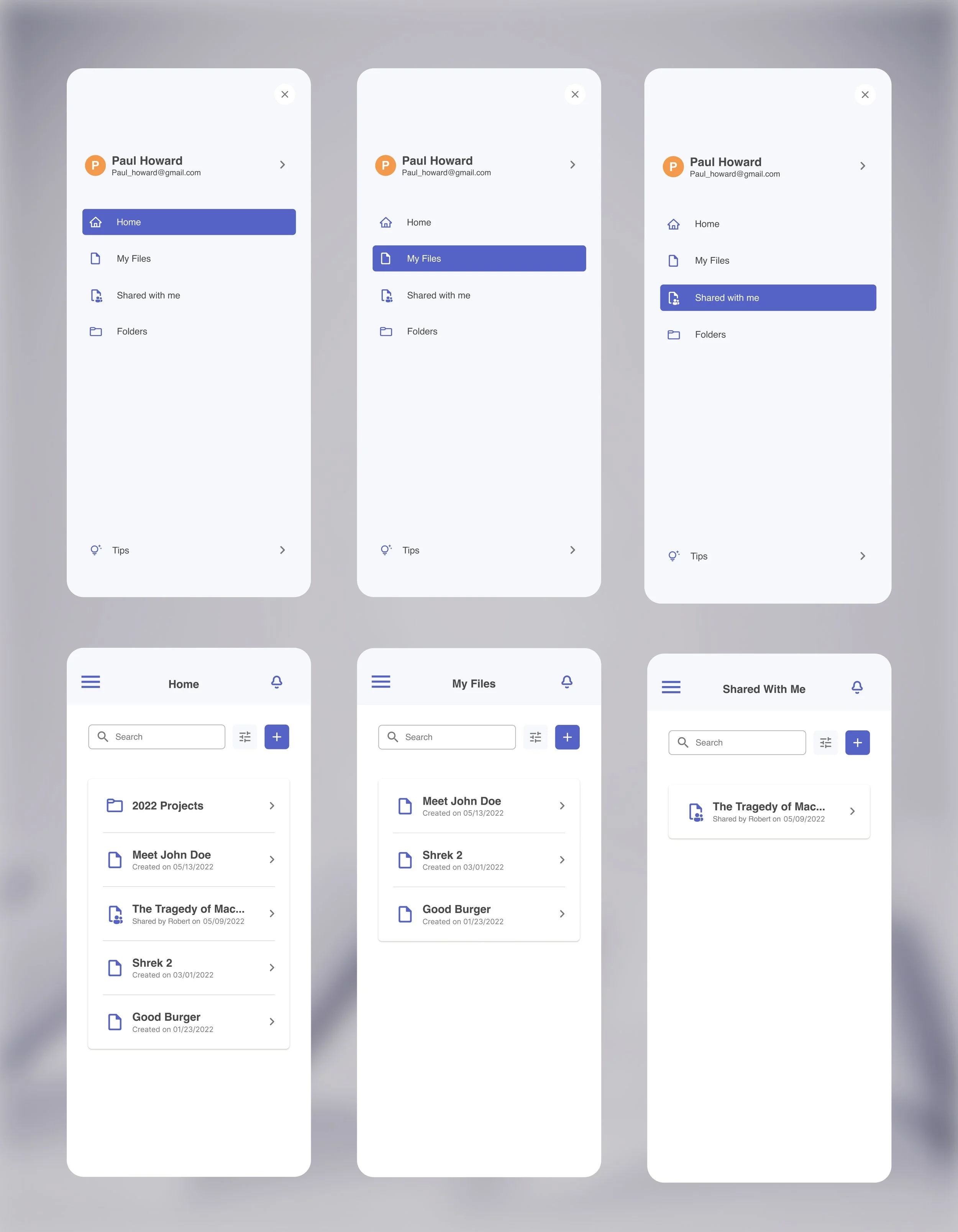
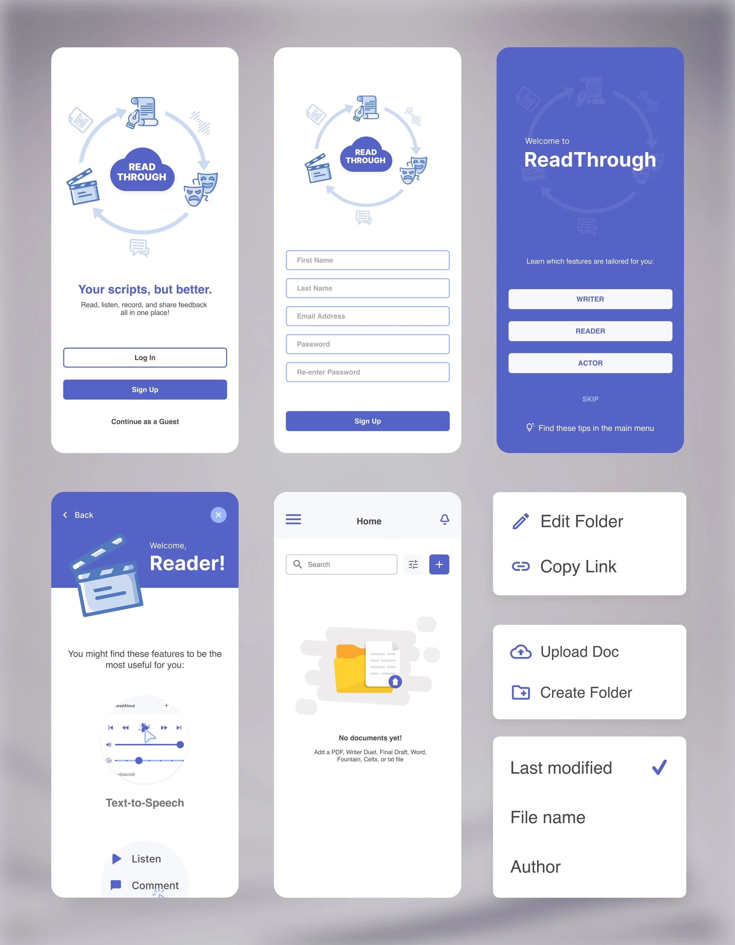
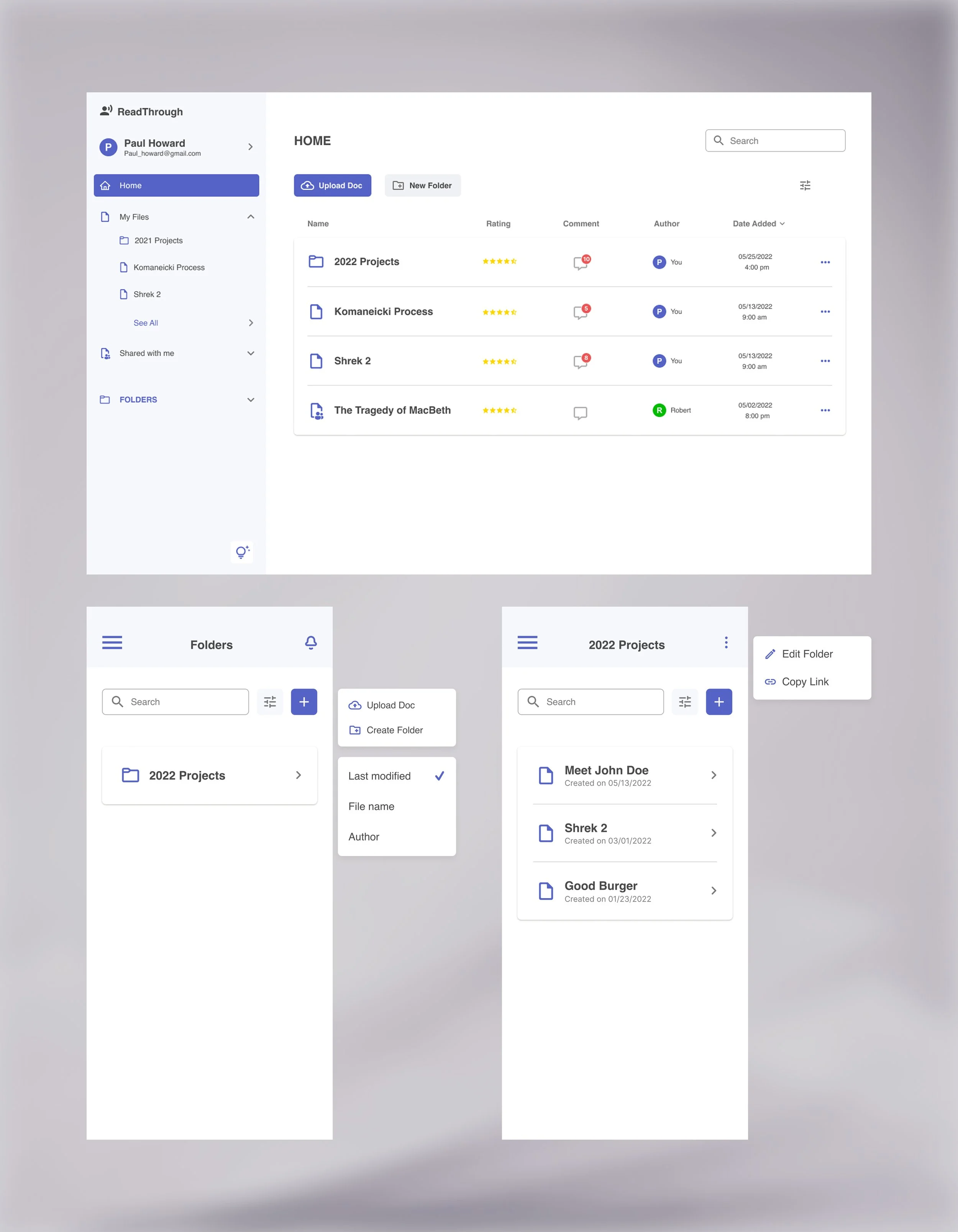
I designed the mobile experience while my teammate designed the desktop version, and we made the core decisions together so both would feel like one product: filtered views that split documents into Home, My Files, Shared with Me, and Folders; a short, optional onboarding that adapts to how each person plans to use the app; and an easier path to the features people couldn’t find.
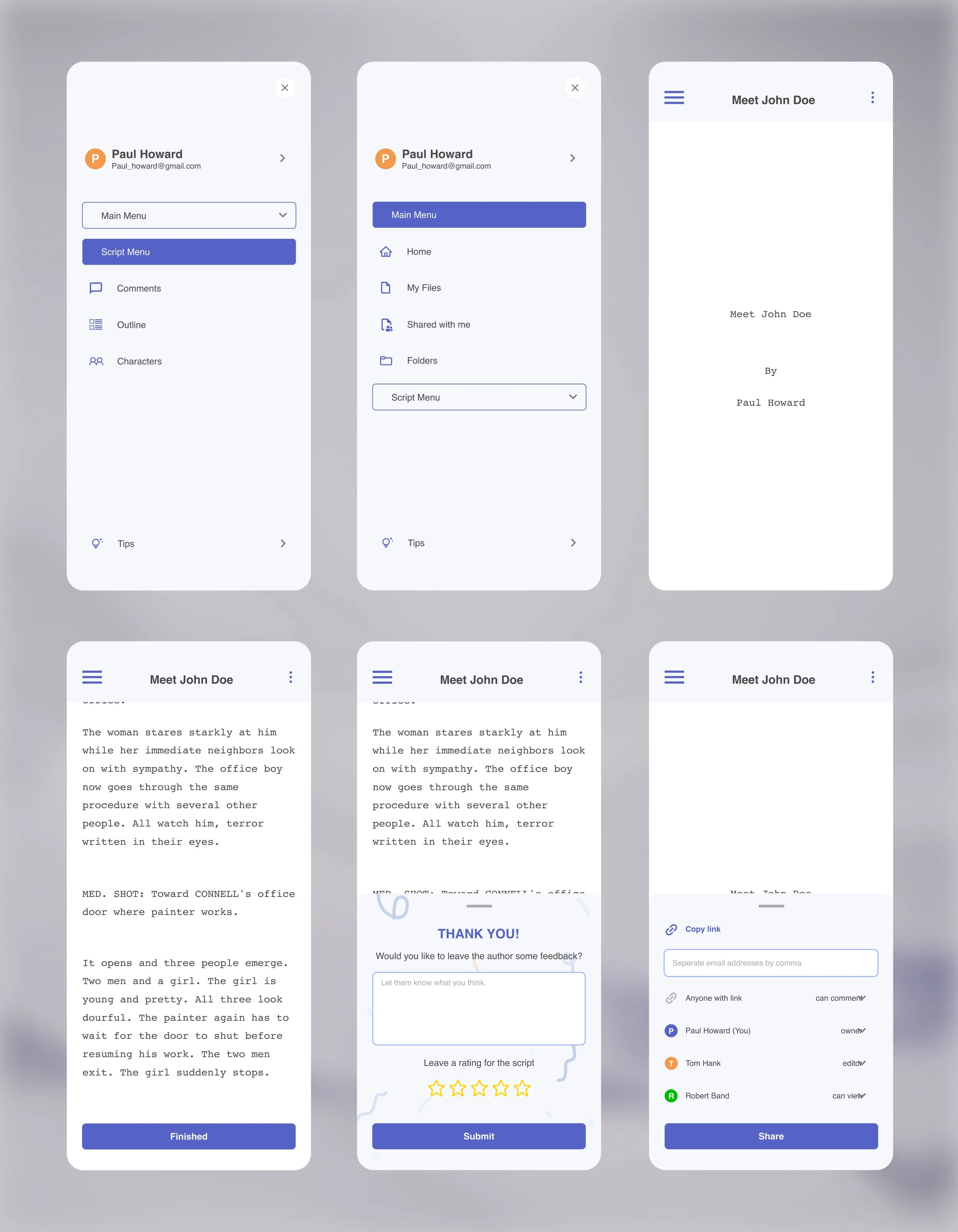
Each of us owned the details specific to our screen size. On mobile, that meant the script menu, which took three rounds: a nested version felt confusing, and a divided one felt cluttered, so I landed on a collapsing menu that gives scripts the full width of the screen while keeping every option close at hand.
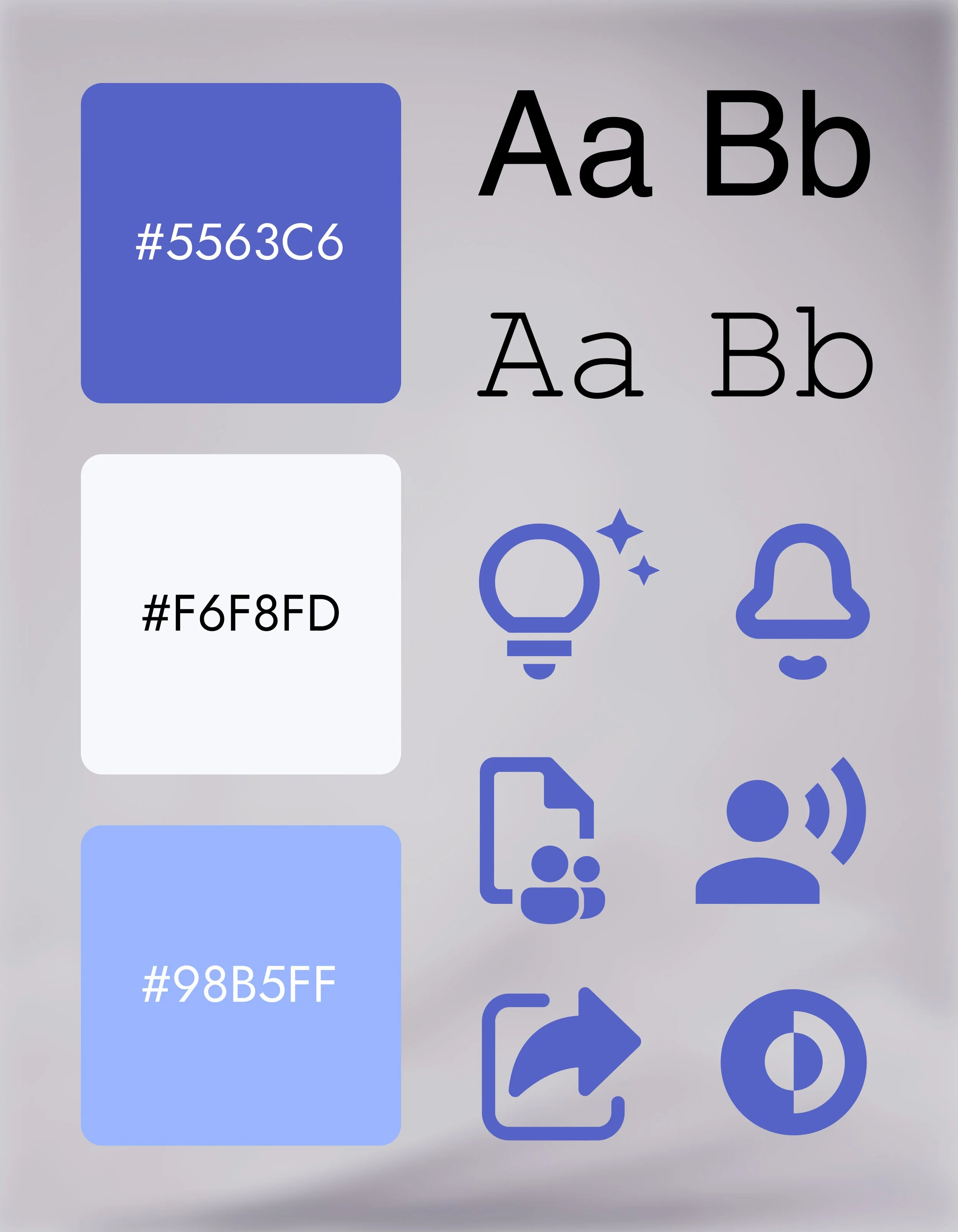
Users also disliked the app’s brown color scheme, so we kept its purple accent and built a cleaner, more modern look around it.
The Outcome
The first updates based on our research shipped in late 2022. Designing the mobile experience alongside a desktop counterpart taught me to make decisions that hold up on every screen while giving each one the layout it needs. I bring that same approach to every website I build, since most people now visit small business sites on their phones.
Looking Back
I’d test the final script menu before handing it off. Of everything we changed, I was least sure about the decision, and three weeks didn’t leave time for another round of testing. Even a small round of testing would have shown whether the collapsing design worked as well in people’s hands as it did on screen.