Shelva’s Help
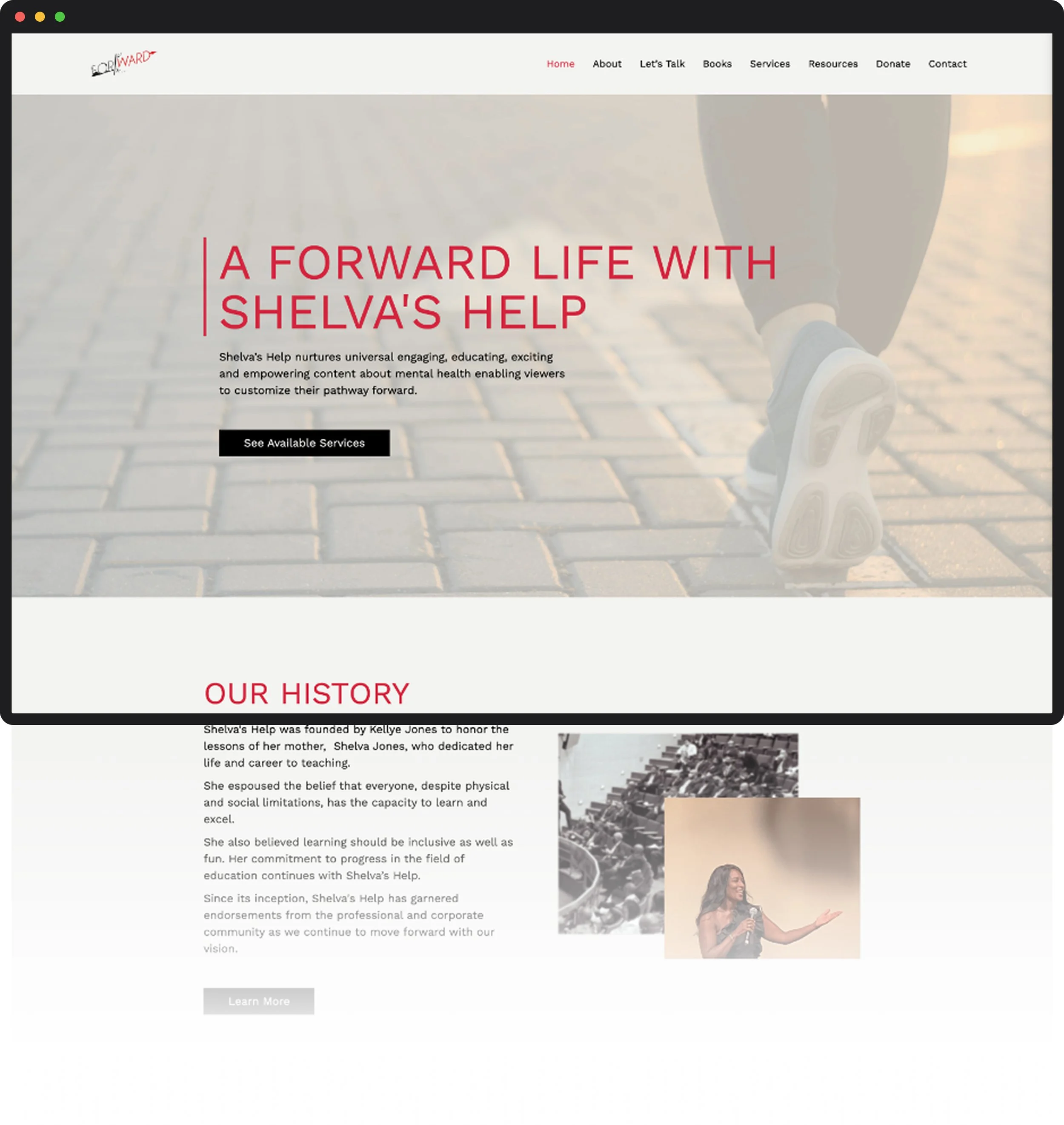
One home for a life coach’s books, coaching, and video library, previously scattered across several platforms.
ROLE
Web Designer on a five-person volunteer team (project manager, content manager, two WordPress developers)
SERVICES
UI/UX design, visual design
TIMELINE
48 hours, June 2023, through 48in48
TOOLS
Figma, WordPress + Beaver Builder
The Brief
Kellye “Coach KJ” Jones founded Shelva’s Help to honor her mother, Shelva Jones, a lifelong teacher who believed anyone can learn and grow regardless of physical or social limitations.
Kellye coaches, speaks, writes books, and co-hosts a podcast, and her videos of people recovering from setbacks like aneurysms, autism, concussions, and PTSD were spread across a GoDaddy site, a coaching site, and several Facebook pages.
She came to 48in48 with a logo and photos but no single home for any of it. Her request was simple: anyone landing on the site should quickly learn who she is and what she does, then find the part meant for them, whether they wanted coaching, the video library, or a way to donate.
The Approach
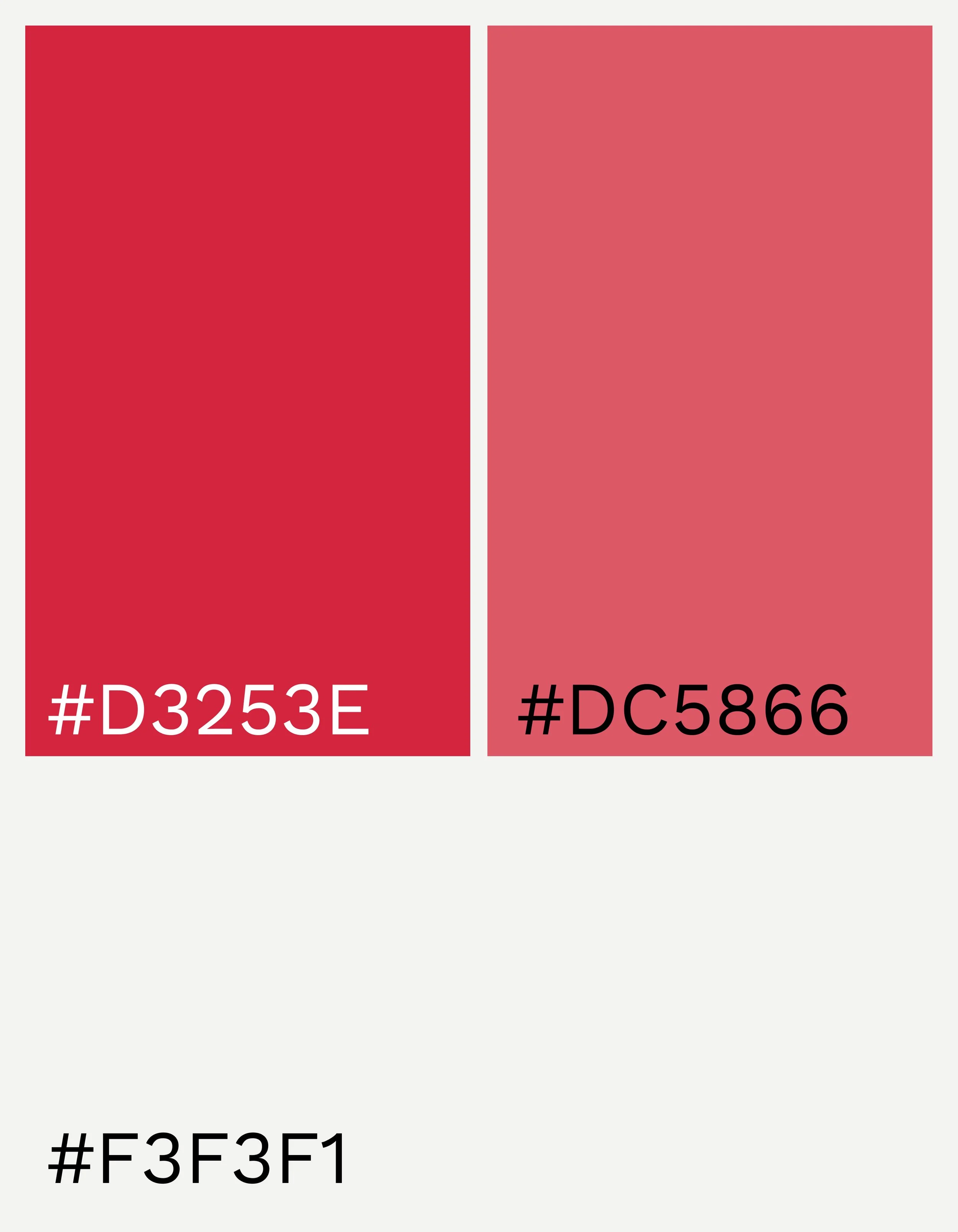
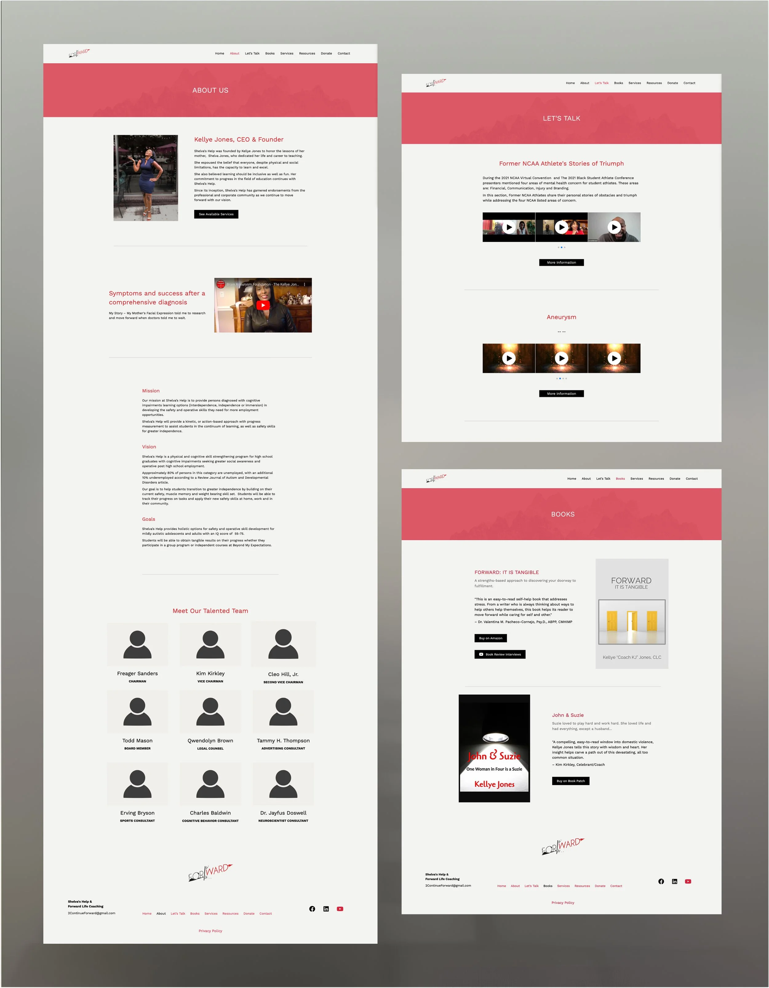
I started from the logo Kellye already had, the word “Forward” with a red arrow, and built the palette around its red. We tried the logo’s exact red first, but across a full page it felt harsh, and Kellye wanted something softer. I adjusted the reds so they blend with the logo instead of matching it exactly, keeping the color she loved while making the site easier on the eyes, then paired them with warm off-whites and black buttons.
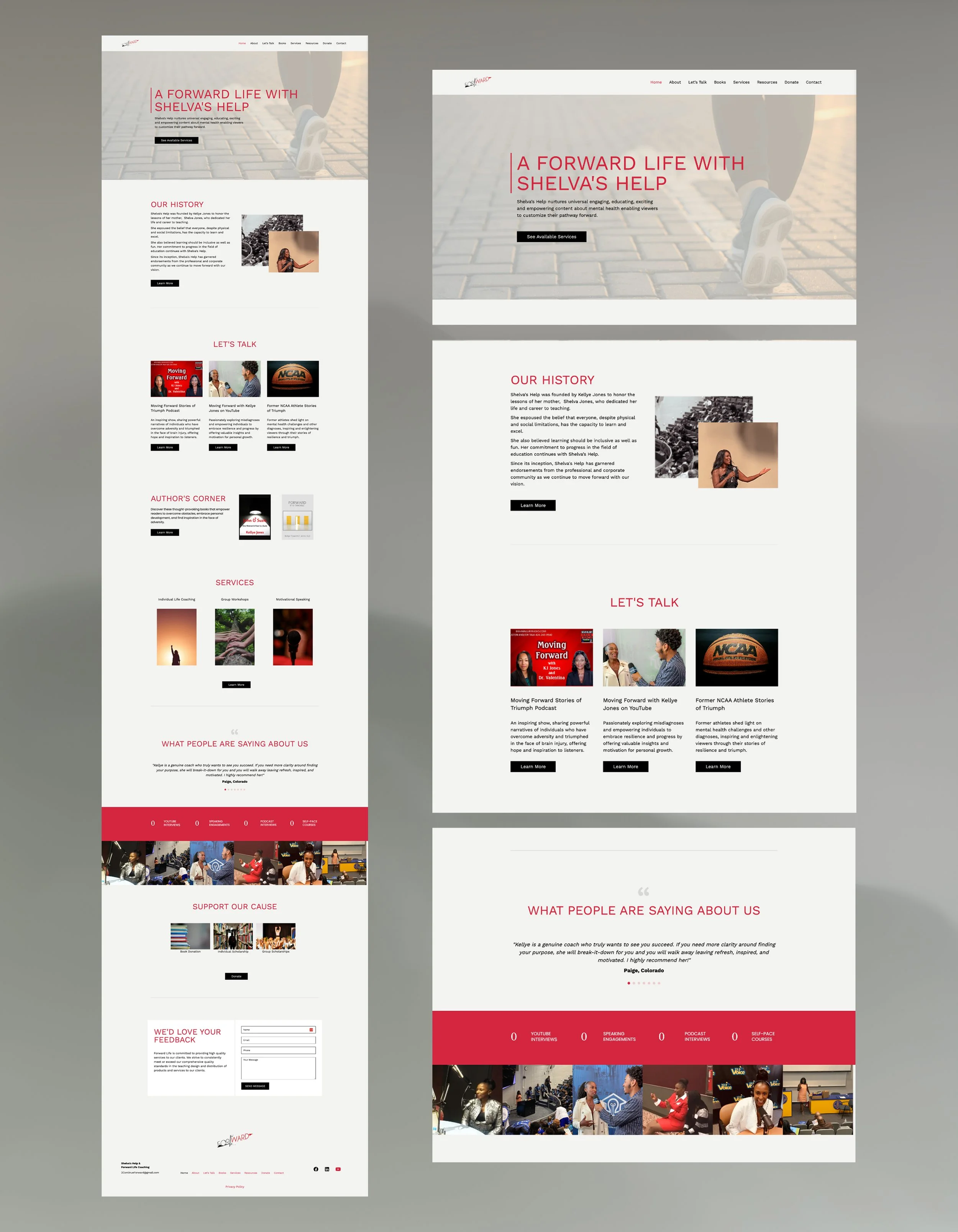
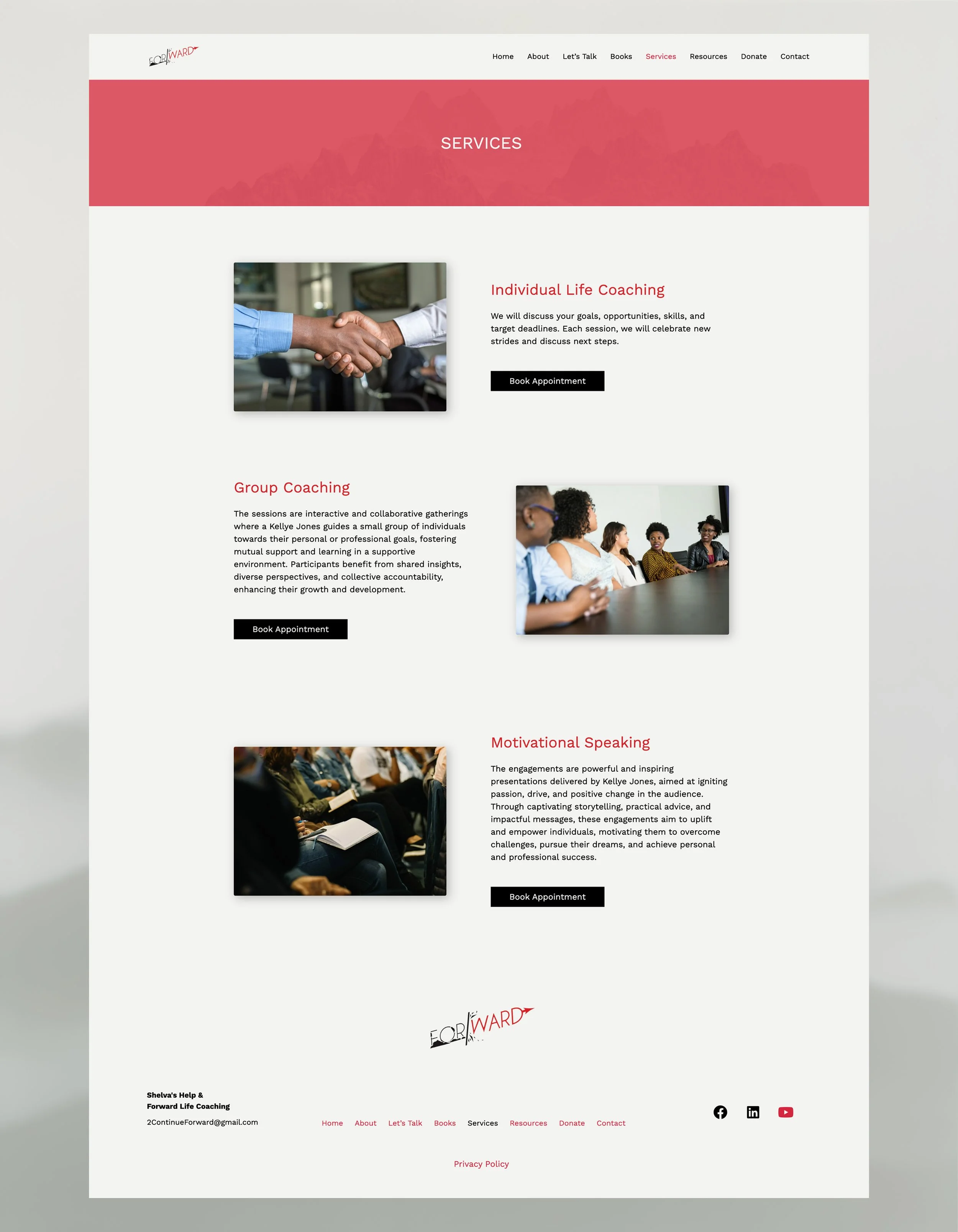
For the homepage hero, I chose a photo of someone mid-stride and paired it with “A Forward Life,” so the idea of moving forward lands before anyone reads a word. I ordered the homepage around what mattered most to Kellye: her history first, then her interviews and podcast, then her books, with services last. Each section previews one part of her work and ends with a single button to go deeper.
The Outcome
The team designed, built, and launched an eight-page site over two 12-hour days. Kellye went from content scattered across several platforms to one home for her coaching, books, and video library. Her team photos and some videos weren’t ready during the event, so we built those sections as placeholders she could fill in herself after launch.
Looking Back
I’d carry the same softening I used on the red over to the buttons. The logo’s black is a warm near-black, but the buttons went out as pure black, the harshest contrast on a page built around soft reds and warm off-whites. A warm charcoal would stay true to the logo, keep the buttons easy to spot, and finish the job the red palette started.
I’d also include search in the site’s plan from day one. Page names like “Let’s Talk” came from the founder, and next time I’d suggest descriptive alternatives, such as “Video Stories,” along with search-optimized page titles and descriptions, while still leaving the final call with her.